RENEGADE GARDENER™
The lone voice of horticultural reason
Why Beautiful Landscapes are So Odd
 |
| John Thomas Smith |
11-01-11– Imagine that it’s time to plant the back yard shade tree you’ve always wanted. You measure the width of the yard side to side, then the distance from the house to the rear property line, and using these two measurements, you plant the tree smack dab in the middle of your yard. Have you broken any laws?
Perhaps not any you would find on the books at your local city zoning office, but you’ve broken a near timeless, major rule. How major? You should shiver to know that Roman architect and engineer Marcus Pollio (75 BC – 15 BC), Italian artist, inventor and engineer Leonardo da Vinci (1452 – 1519) and British painter John Thomas Smith (1766 – 1833) would each give you a stern reprimand for such utter design dereliction. Let’s start with Smith.
Gaze at a prize-winning photograph of a landscape, or a famous painting of the pastoral English countryside by a European Old Master. No doubt it includes a horizon – the horizontal line where sky meets ground. Where is this line? Most often it’s approximately one-third of the way up from the bottom of the frame (if the work features a brilliant sky) or one-third down from the top (if the objects on land are the primary subject).
 |
Similarly, a striking photo of a tree (or standing human subject) is best arranged so that the tree, or person, is about one-third of the distance in from either the right or left side of the frame. (In amateur snapshots taken during travel, the vacationing couple usually will be centered, the Eiffel Tower or Washington Monument violently thrusting upward through the tops of their heads.) |
| Ponderosa pine, Lake Diabolo, Washington |
 |
| Fisherman, Homer Spit, Alaska. Imagine if I had centered him in my viewfinder. |
Smith, an English painter and engraver, was the first person to describe this simple, effective technique, calling it The Rule of Thirds. Writing on the subject as it pertains to painting, he notes, “Applying this rule, generally speaking, whether of light, shade, form, or color, I have found the ratio of about two thirds to one thirds, or of one to two, a much better and more harmonizing proportion, than the precise formal half, the too-far extending four-fifths, and, in short, than any other proportion whatever.”
 |
| Awareness of the Rule of Thirds immediately makes you a better photographer. Note its use in this photo I took of a shed in Sierra Valley, California. |
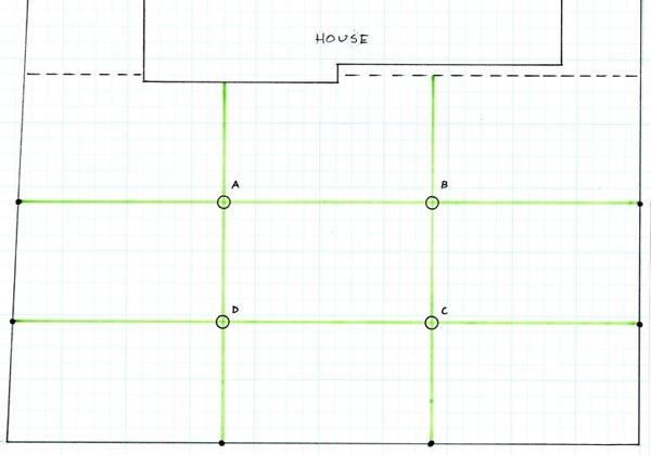
So what has this to do with garden design in general, and the planting of that back yard shade tree in particular? Centering single objects in the yard, such as our shade tree, is not as pleasing to the eye as planting the tree off-center so that it rises from a point on one of the two lines running from the rear property line to the house that are each one-third in from the two side property lines.
Now slide the tree along either of these two vertical “one-third lines” until it intersects a point made by either of the two horizontal lines dividing the property into thirds from rear property line to house. This is one of the four key points, that is, a point where the vertical and horizontal lines used to divide the yard (or painter’s canvas, or photographer’s viewfinder) into nine equal rectangles intersect.
 |
| Plant your back (or front) yard tree at point A, B, C or D. |
This works just as well when choosing a spot for a shade, evergreen or ornamental tree in the front yard. If the front door is not centered on the property, as it usually isn’t, one would choose the vertical one-third line farthest from the front door of the house (never plant a tree directly or nearly in front of the front door, no matter how far out from the door).
Ancient Origins
Smith may have coined the phrase, but artists and architects from centuries before had discovered and used the rule for its aesthetic benefit. Pollio – called the world’s first engineer to be known by name – had a keen interest in discovering the natural ratios and proportions in nature, which he incorporated into his architectural designs. In his mammoth tome, “Ten Books on Architecture” he notes:
- The distance from the bottom of the chin to the nose is one-third of the length of the head
- The distance from the hairline to the eyebrows is one-third the length of the face
- The length of the ear is one-third the length of the face
There’s that one-thirds rule again. It’s a simple design ratio (1:3, 2:3) for placing subject matter that creates a face, photograph, painting or landscape that is pleasing to the eye.
The Rule of Odds
 |
| Our last job of the season. The three pyramidal evergreens are Blue Arrow Junipers, and eventually they’ll hit nine feet. And boy oh boy, does the design ever scream for that third one on the right. |
This aesthetically pleasing ratio – based on the odd number, three – also relates to why an odd number of objects look better than an even number. It’s why (most often) you plant three shrubs of the same variety instead of two or four, and use three of the same perennial to fill a space instead of two. (There are always exceptions, most often caused by structural symmetry that beckons formality; perhaps another time.)
Using an odd number of plants extends even further. If a large space needs filling, five perennials look better than four. If planting a line of shrubs of several different varieties along the side of your house, seven will look better than six, and five better than four. If all the shrubs are the same variety – the goal is to have them grow into a single hedge – you can then toss even/odd out the window, and plant the number of shrubs that fulfills the length of hedge required.
When adding colorful, blooming crabapple or other ornamental trees to your property, you can plant one in the front yard and one in the back yard (a total of two), because each is in its own canvas. If grouped where they can be seen in one view, one would plant three, not two, or five, not four.
 |
 |
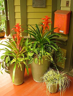
Keeping things odd is key to successful grouping of containers. One large, colorful container of flowers in a corner of the deck or patio looks great. But add a second container and it will look less so. Something is missing, and what’s missing is the third container. If the three containers are three different sizes – large, medium, small – it looks extra terrific. This is why some containers come in matching sets of three, the smallest about one-third the size of the large one, and the medium container about two-thirds the size.
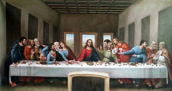
As to our dear friend da Vinci? Examine his painting, “The Last Supper.” In his placement of the banquet table, the three walls, three windows, and placement of the figures (most notably Judas, one-third in from the left), one sees immediately his understanding of the rule of thirds.

Don Engebretson
The Renegade Gardener